Design Panel
Reference for Design tab fields shared across components. Component-specific options are in each component reference. Layout theory: Layout System.
Design tab structure
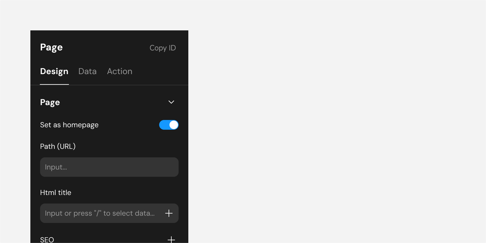
| Section | Description |
|---|---|
| Title & ID | Component name and unique ID |
| Alignment toolbar | Quick align and distribute |
| Custom configuration | Component-specific fields (e.g. List header, Text content) |
| Position | Positioning type, offsets, z-index |
| Size | Width, height, margin, padding |
| Layout | Flex direction, alignment, gap, wrap, overflow (containers only) |
| Style | Visibility, opacity, background, border, shadow, blur |
| Text | Typography when the component shows text |
In web apps, position, size, layout, and style can be overridden per breakpoint. See Breakpoints.
Title and ID

| Field | Description |
|---|---|
| Title | Name in tree and sidebar; hover to rename |
| ID | Copy for debugging and support |
Alignment and distribution

| Selection | Result |
|---|---|
| Single component | Align to parent edges (absolute / fixed only) |
| Multiple components | Align to each other; distribute when ≥ 3 selected |
See Layout System · Positioning.
Custom configuration
Per-component fields (List carousel, Text content, etc.). See Display, Input, Layout, Other references.
Edit states
Button and View support Normal and Hover under Edit State in web apps.
Position
| Field | Description |
|---|---|
| Position type | Relative, absolute, fixed |
| Offsets | top / right / bottom / left for absolute and fixed |
| Z-index | Stacking order |


Size
| Field | Description |
|---|---|
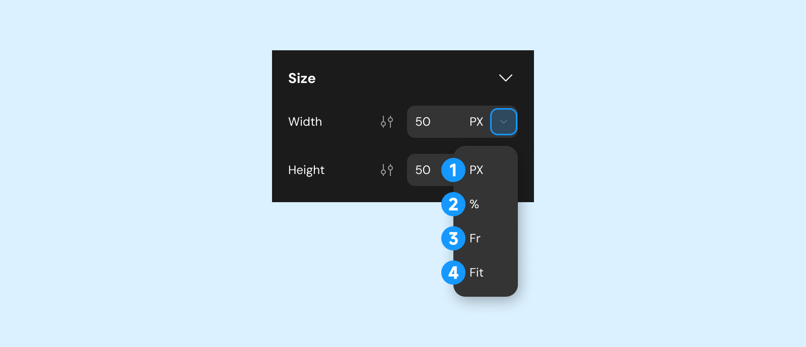
| Width / height | px, %, fr, fit content; min/max where supported |
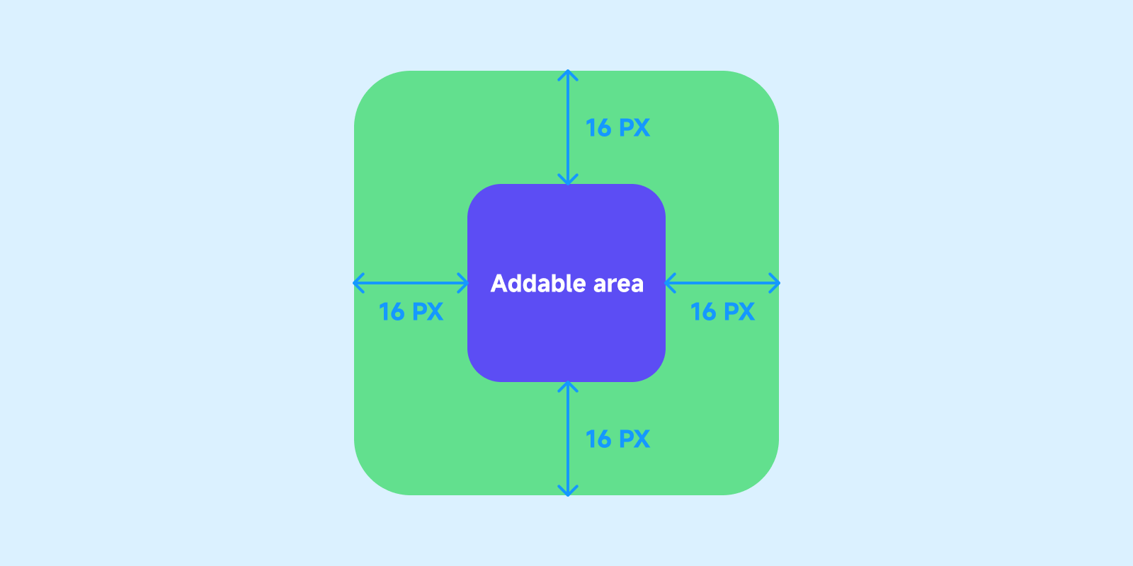
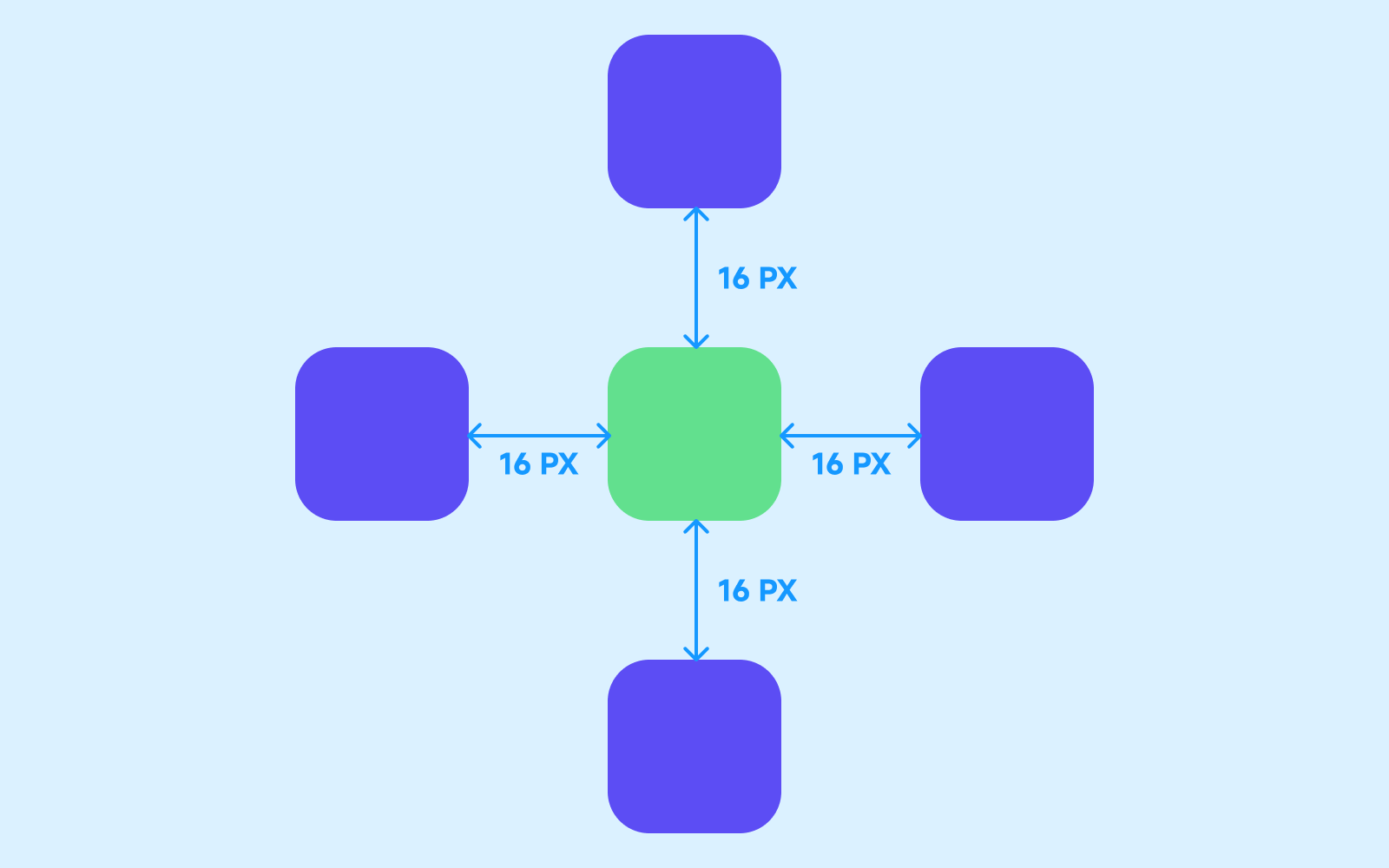
| Margin | Outer spacing |
| Padding | Inner spacing (not on all components) |
| Padding | Margin |
|---|---|
 |  |
Layout
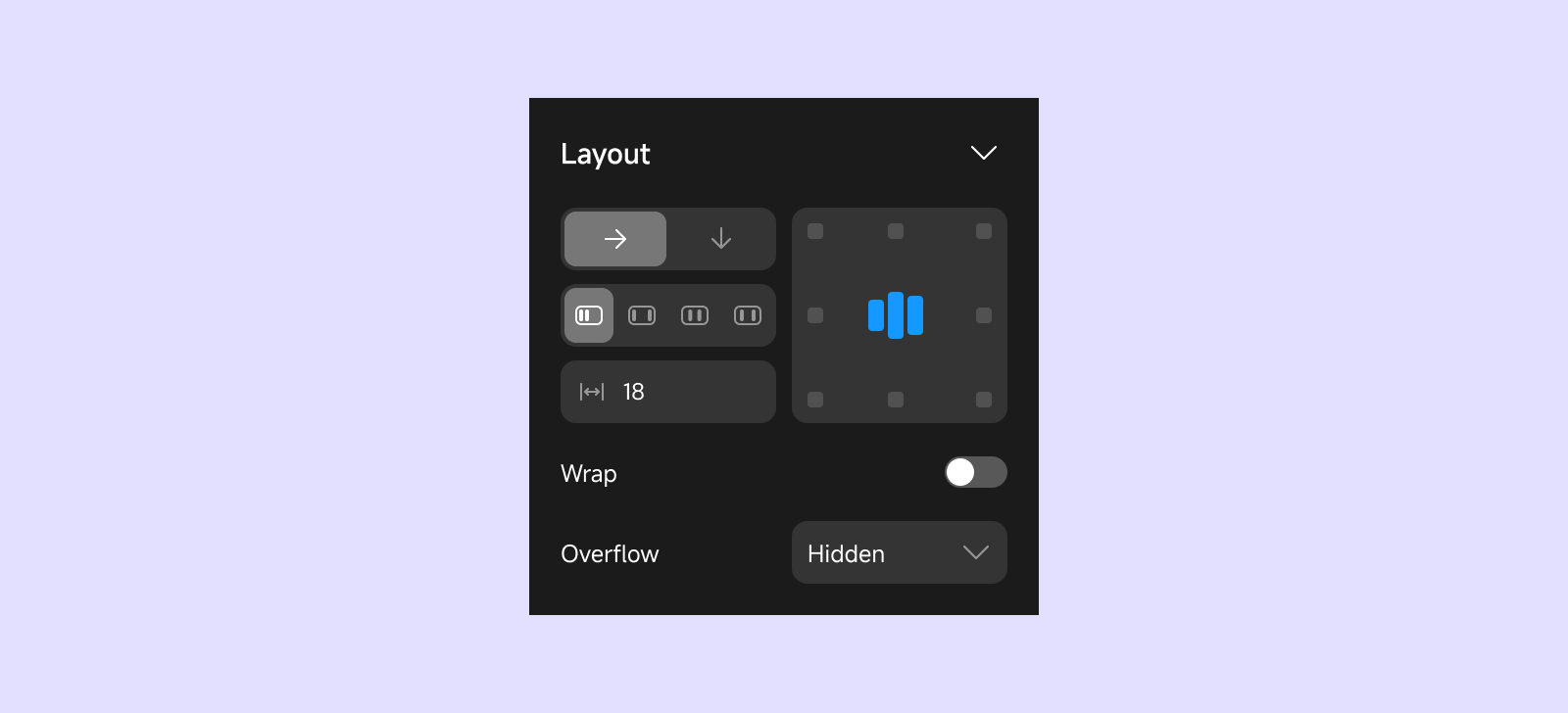
On pages, modals, and views — controls child arrangement.
| Field | Description |
|---|---|
| Direction | Horizontal or vertical |
| Main / cross axis alignment | Distribution along and across the flex direction |
| Gap | Space between children |
| Wrap | Wrap to next row/column when full |
| Overflow | Scroll, visible, or hidden |
Style
| Field | Clients | Description |
|---|---|---|
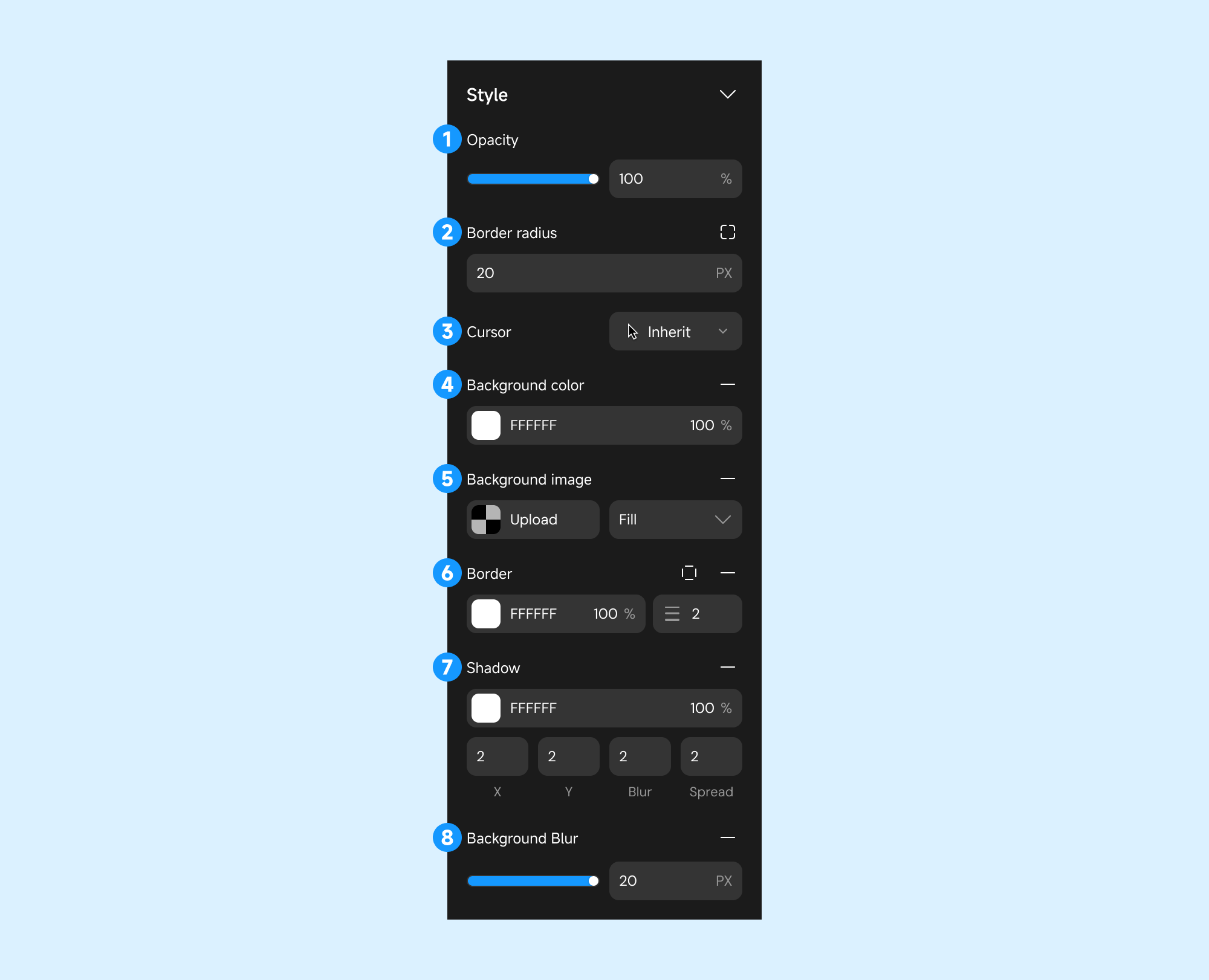
| Visibility | Web app | Show/hide; per-breakpoint hide |
| Opacity | All | Transparency |
| Cursor | Web app | Hover cursor |
| Background | Varies | Color (solid or gradient), image |
| Border | Varies | Color, width, radius |
| Shadow | Varies | Box shadow |
| Background blur | Varies | Frosted glass effect |
Text
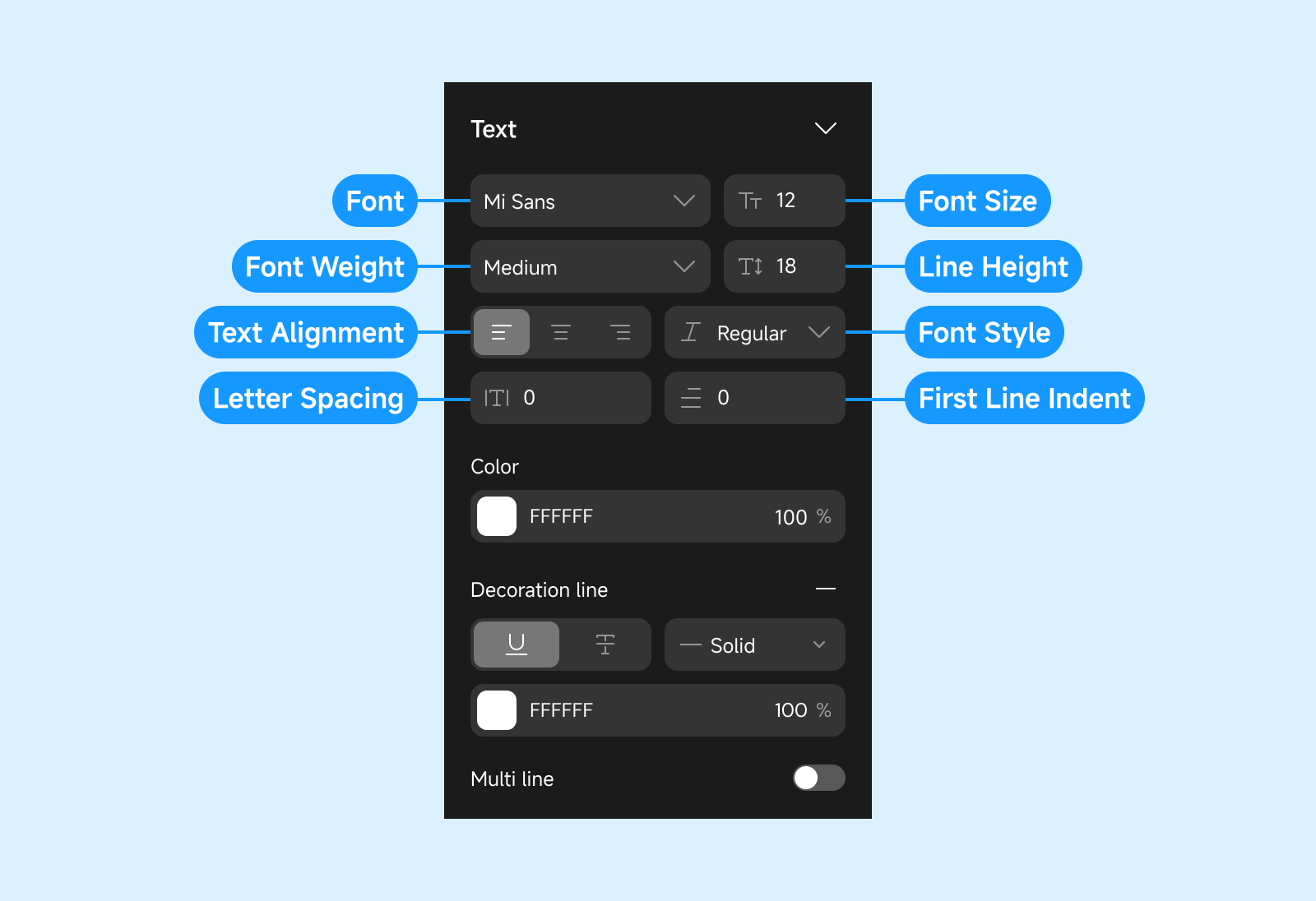
For components that render text — font, size, weight, color (solid or gradient), line height, letter spacing, alignment.
Gradients (background and text alike): set the angle and multiple color stops. A gradient built by
AI may use a direction keyword such as to top right, or stops bound to theme color roles; the
panel shows both as they are, and replaces them with the angle and plain colors you set once you
edit that gradient here.