Build Your First Page
This guide walks through one complete UI interaction in Momen. You will build a page with text and a button, open a custom modal from the button, and close the modal from inside it.
If the editor is new to you, start with Editor Overview. For the relationship between clients, pages, modals, and components, see UI Organization.
Select a client and create a page
Pages and components belong to the current client. Select the client at the top of the left sidebar before you start.
- Open the Pages list in the left sidebar.
- Select + at the top of the list.
- Double-click the new page name and rename it
Example Page. - Select the page to open its canvas.
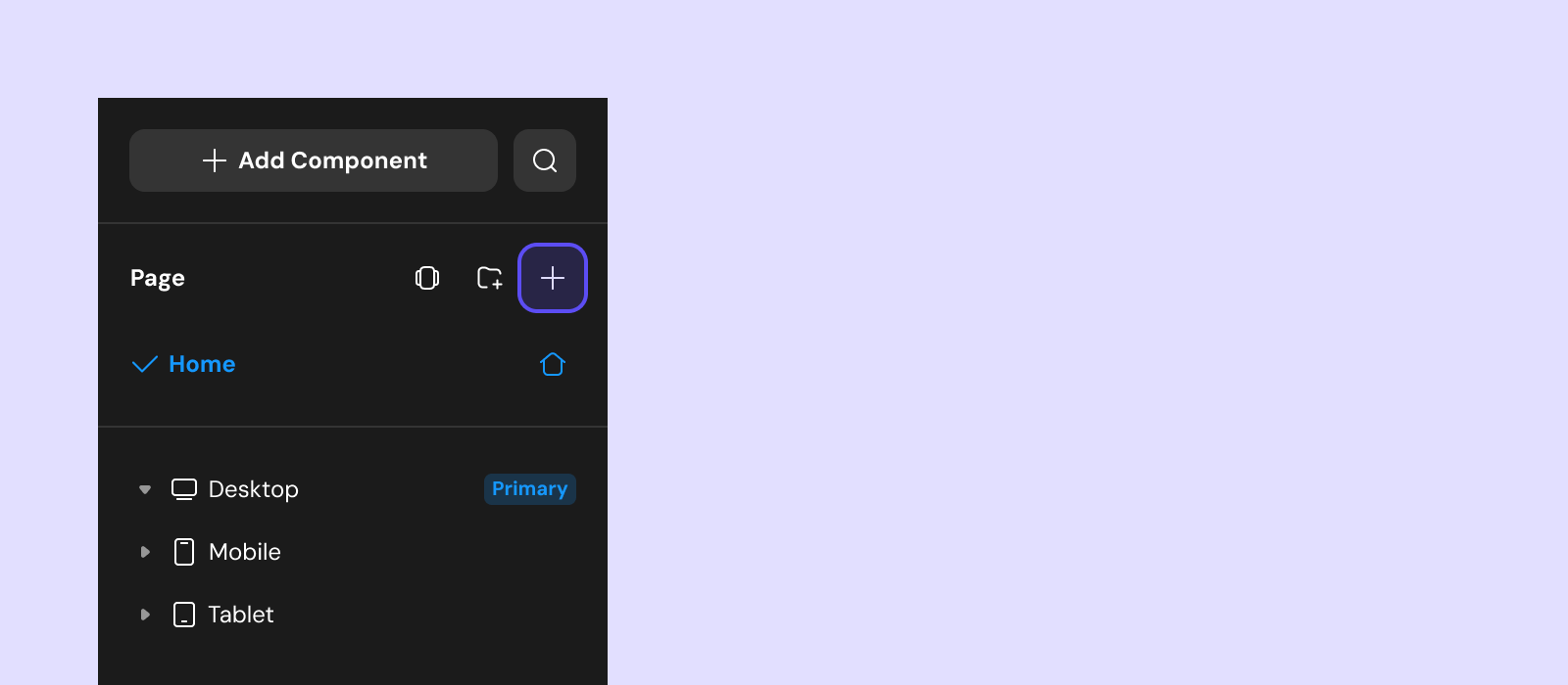
Each client has its own pages and UI. If the project does not have the client you need, create it from the client entry first. See UI Organization for details.
Add and configure components
Start by adding text as the page content.
- Select the page canvas.
- Open the Components tab in the left sidebar.
- Select + to open the component library.
- Find Text in the System category, then drag it onto the canvas or double-click it.
- Select the text component and use the right panel to change its content, position, and style.
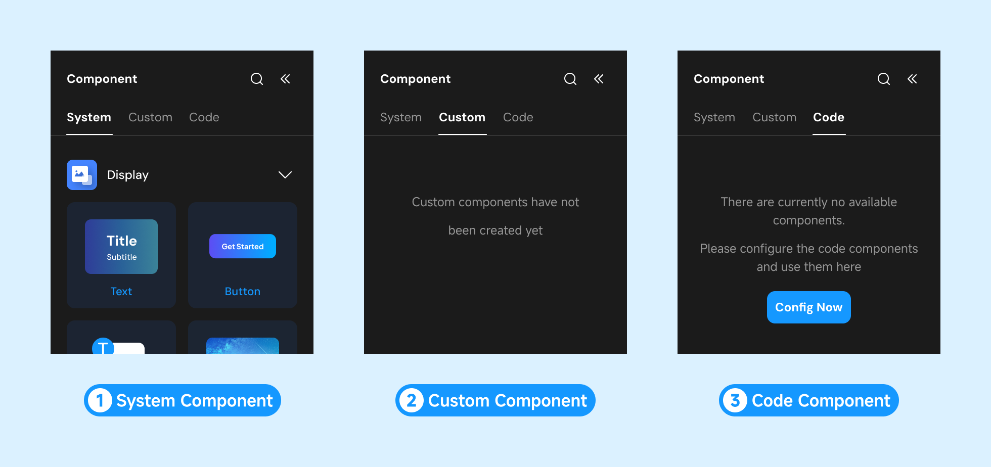
Dragging lets you choose the target container or component-tree level. Double-clicking adds the component to the currently selected page or container. See Design Panel for field details and UI Shortcuts for common editing operations.
Create and design a custom modal
Next, create the custom modal that the page button will open.
- Switch to the Modals list in the left sidebar.
- Select + at the top of the list.
- Rename the new modal
Example Modal. - Select the modal and add a Text component with the content you want to display.
- Add a Button and change its label to
Close. - Select the
Closebutton and add an On click trigger in the Action panel. - Under the trigger, add Toast & modal → Close modal.
Modals can define inputs and outputs to receive page data or return values entered by the user. This guide does not pass data between the page and modal; see Pages & Modals for those fields.
Open the modal from the page
A modal is not opened through a route. Connect it to a frontend action on the page.
- Return to
Example Page. - Add a Button from the component library and change its label to
Open Modal. - Select the button and add an On click trigger in the Action panel.
- Under the trigger, add Toast & modal → Open modal.
- Set the mode to Open custom modal.
- Select
Example Modalas the target modal.
The page button and custom modal are now connected. See Toast & Modal for modal parameters, follow-up branches, and outputs.
Preview the result
- Select
Example Page. - Select the play icon in the upper-right corner of the canvas to open the preview in a new tab.
- Select
Open Modaland confirm thatExample Modalopens. - Select
Closeand confirm that the modal closes.
Preview validates the current editor state. It does not replace publishing the project.
Next steps
- Configure page and modal design, data, actions, inputs, and outputs in Pages & Modals.
- Look up component position, size, layout, and style fields in Design Panel.
- Learn the box model, Flexbox, positioning, and web app breakpoints in Layout System.
- Review toast, open-modal, and close-modal actions in Toast & Modal.