Breakpoints
Specification reference for web app breakpoints: widths, inheritance, overridable fields, and hide rules. Concepts: Layout System. Setup: Build Your First Page.
Built-in widths
| Breakpoint | Range | Notes |
|---|---|---|
| Desktop | 1280px – 1920px | Primary breakpoint — build structure here first |
| Tablet | 768px – 1279px | Inherits Desktop unless overridden |
| Phone | 0px – 767px | Inherits Desktop unless overridden |
Inheritance and overrides
| Rule | Description |
|---|---|
| Scope | Web apps only |
| Primary | Desktop (fixed) |
| Inheritance | Tablet and Phone inherit Desktop; Tablet and Phone do not inherit each other |
| Desktop edit | Syncs to Tablet/Phone until those breakpoints override a field |
| Override | Once edited on Tablet or Phone, that field stops following Desktop |
| Reset | Use Reset on a field to inherit from the parent breakpoint again |
Recommended workflow
- Complete layout on Desktop.
- Switch to Tablet — change only what differs.
- Switch to Phone — stack, scroll, hide.
- Re-check Desktop so phone-only tweaks were not applied there.
Overridable design fields
| Section | Examples |
|---|---|
| Position | Type, offsets, z-index |
| Size | Width, height, min/max, margin, padding |
| Layout | Direction, alignment, gap, wrap, overflow |
| Style | Visibility, opacity, background, border, shadow |
💡
Custom configuration, Data, and Action tabs are generally not split by breakpoint.
Hide at a breakpoint
💡
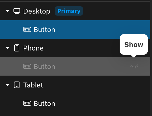
To hide on one breakpoint only, use visibility — do not delete the component from the tree.
| Action | Result |
|---|---|
| Delete on Desktop | Removed everywhere |
| Hide on Phone | Still in tree; hidden on Phone only |
| Hide on Tablet | Affects Tablet only |
Relation to mobile apps
A mobile app is a separate client. It does not participate in web app breakpoint inheritance.
Last updated on