Layout System
Core layout concepts in Momen: box model, positioning, Flexbox, overflow, and web app responsive breakpoints. For the editor fields that map to these concepts, see Design Panel.
Box model
Purpose: control a component’s physical bounds and spacing.
Think of each element as a box with padding and margin:
| Part | Description |
|---|---|
| Content | Text, images, and other rendered content |
| Size | How width and height are calculated (see table below) |
| Padding | Space between border and content |
| Margin | Space between this component and siblings |
Size modes
| Mode | Description |
|---|---|
| Pixels (px) | Fixed size; does not flex |
| Fit content | Sized by inner content |
| Percent (%) | Share of parent container |
| Fraction (fr) | Proportional share of remaining space |
Set min/max width and height to avoid extreme layouts on small or large screens.
| Padding | Margin |
|---|---|
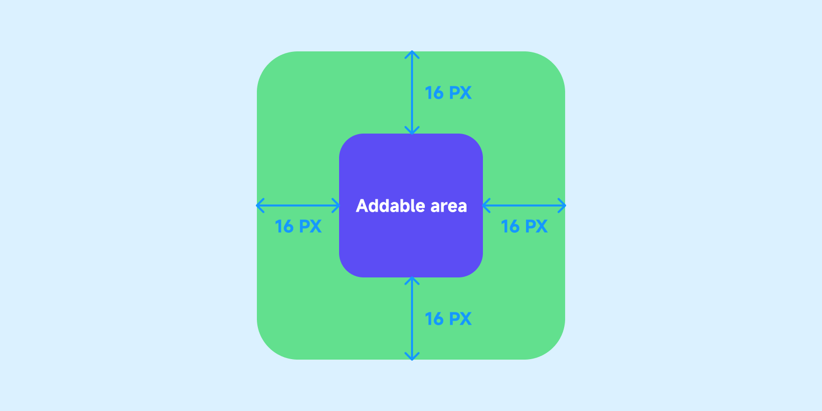 | 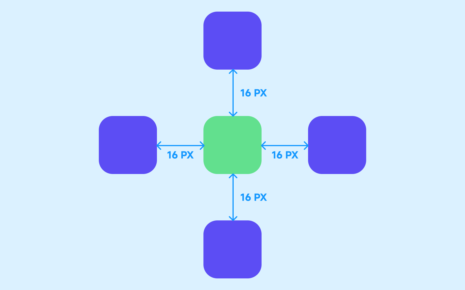 |
Positioning
Purpose: decide whether a component participates in normal flow and what it is positioned against.
| Type | Description |
|---|---|
| Relative | Default. Stays in parent layout flow and follows Flex direction, alignment, and gap. |
| Absolute | Removed from normal flow; positioned with offsets relative to the parent. |
| Fixed | Removed from scroll flow; positioned relative to the viewport. |
Relative
Use for most layouts: cards, vertical stacks, horizontal rows, and responsive reflow with the parent.
Absolute
Use when an element must sit at a precise spot inside a parent without affecting siblings — badges, close buttons, overlay decorations.
| Question | Answer |
|---|---|
| Positioned against what? | Usually the direct parent container |
| Does it take layout space? | No — siblings layout as if it were not there |
Fixed
Use for elements that should stay on screen while scrolling — sticky nav, floating action buttons, bottom bars.
Fixed and absolute both use offsets; absolute is relative to the parent, fixed to the viewport.
Layer and Z-index fields: Design Panel · Position.
Flexbox layout
Purpose: arrange children inside Page and container components.
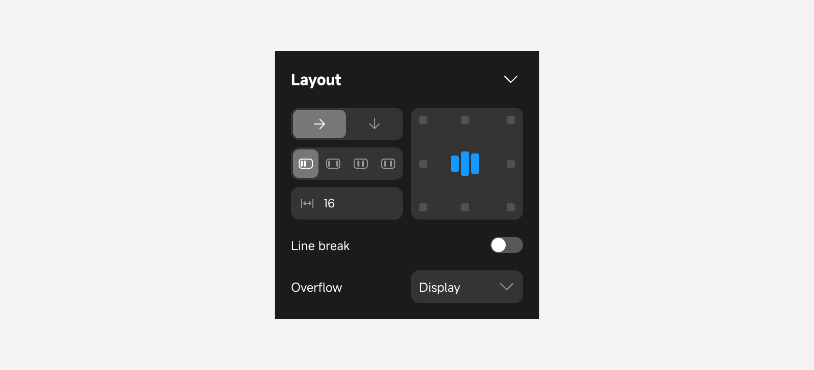
Pages and Views are containers; relatively positioned children follow the rules below.
Direction
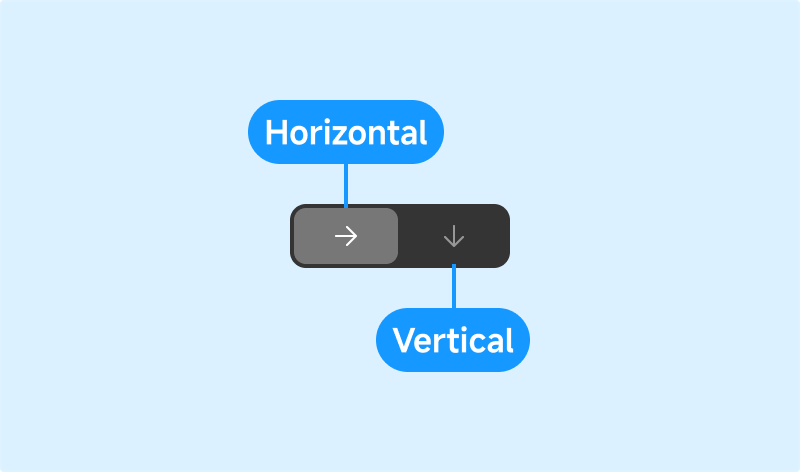
| Direction | Description |
|---|---|
| Horizontal | Children along the X-axis |
| Vertical | Children along the Y-axis |
Distribution and alignment
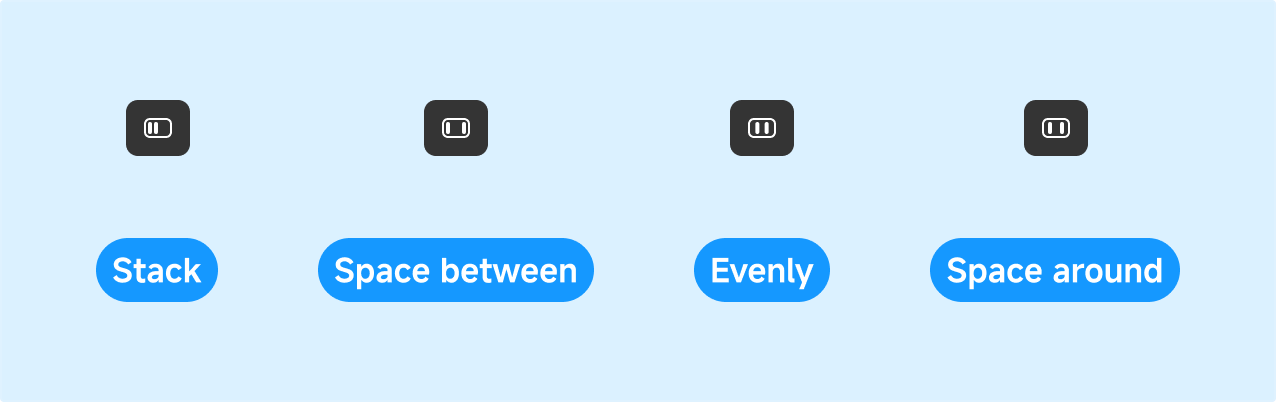
| Distribution | Description |
|---|---|
| Stack (start) | Children grouped at the start |
| Space between | Equal gaps; first and last flush to edges |
| Space evenly | Equal gaps including container ends |
| Space around | Equal space on both sides of each child; end gaps are half of between gaps |
Wrap
When a row (or column) is full, children can wrap to the next line.
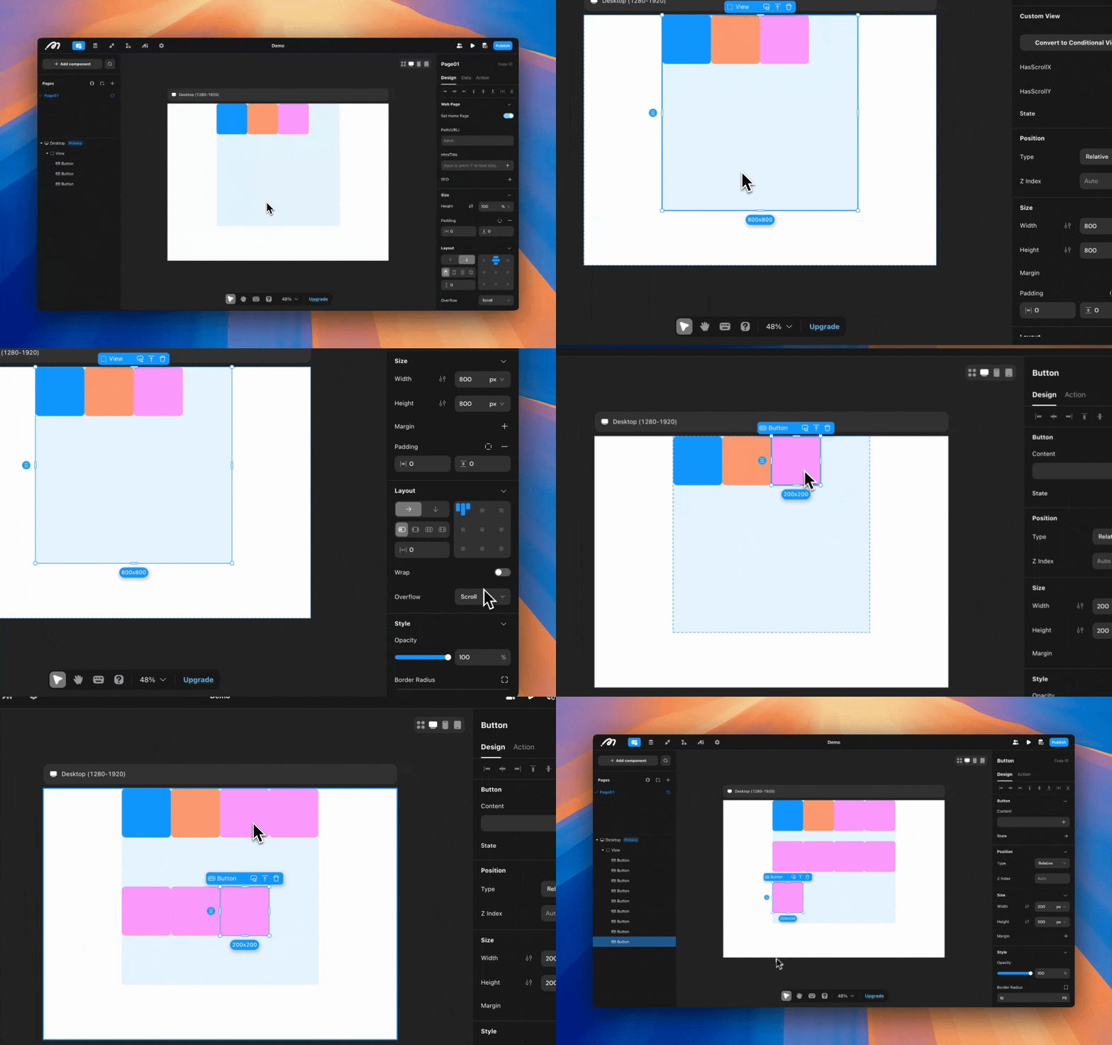
Gap
Uniform spacing between adjacent children.
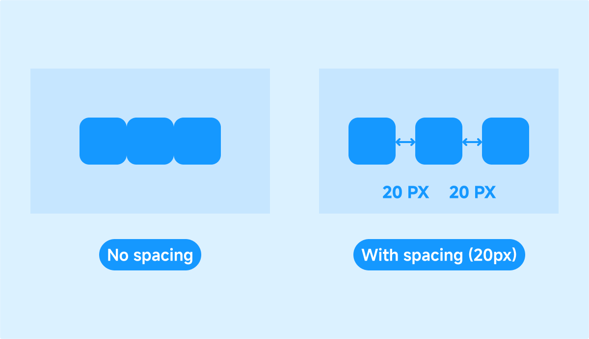
Overflow

| Mode | Description |
|---|---|
| Scroll | Show scrollbar when content overflows |
| Visible | Overflow remains visible |
| Hidden | Clip overflow |
When wrap is off, horizontal and vertical overflow can be controlled separately.
Responsive breakpoints (web apps)
A web app supports Desktop, Tablet, and Phone breakpoints so one web app can adapt layout and style to viewport width.
Desktop is the primary breakpoint. Tablet and Phone inherit Desktop; they are siblings — neither inherits the other.
Breakpoints belong to web apps only. A mobile app is a separate client and does not use web app breakpoints.
| Config | Example |
|---|---|
| Position | Move a floating button on Phone |
| Size | Full-width cards on Phone, fixed width on Desktop |
| Layout | Horizontal on Desktop, vertical on Phone |
| Style | Hide decoration on Phone |
Width ranges, override rules, and per-breakpoint hide rules: Breakpoints Reference.