Layout and Position
Layout
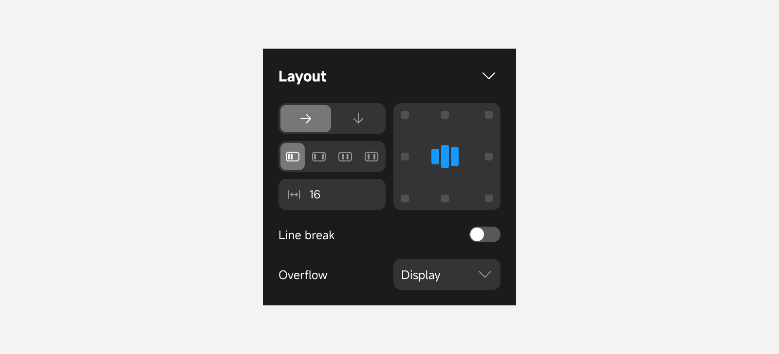
Pages and container components have default layout properties. You can adjust layout settings to arrange components with a “relative” position type according to specified rules, achieving your desired layout effect.
Direction
Specifies the extension direction of the layout.
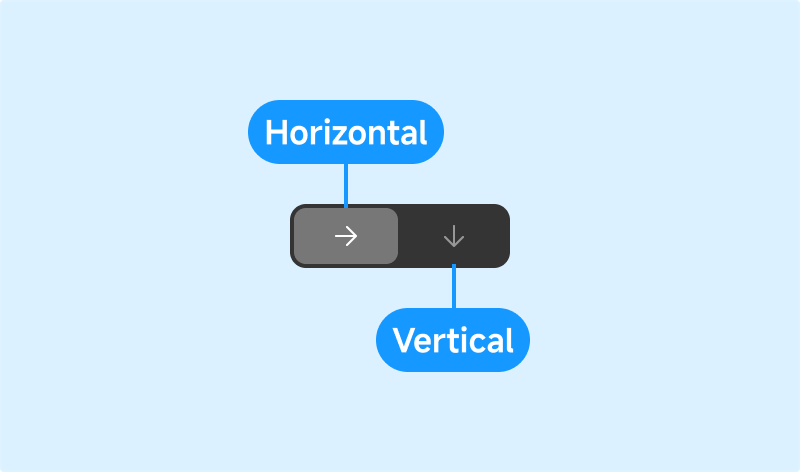
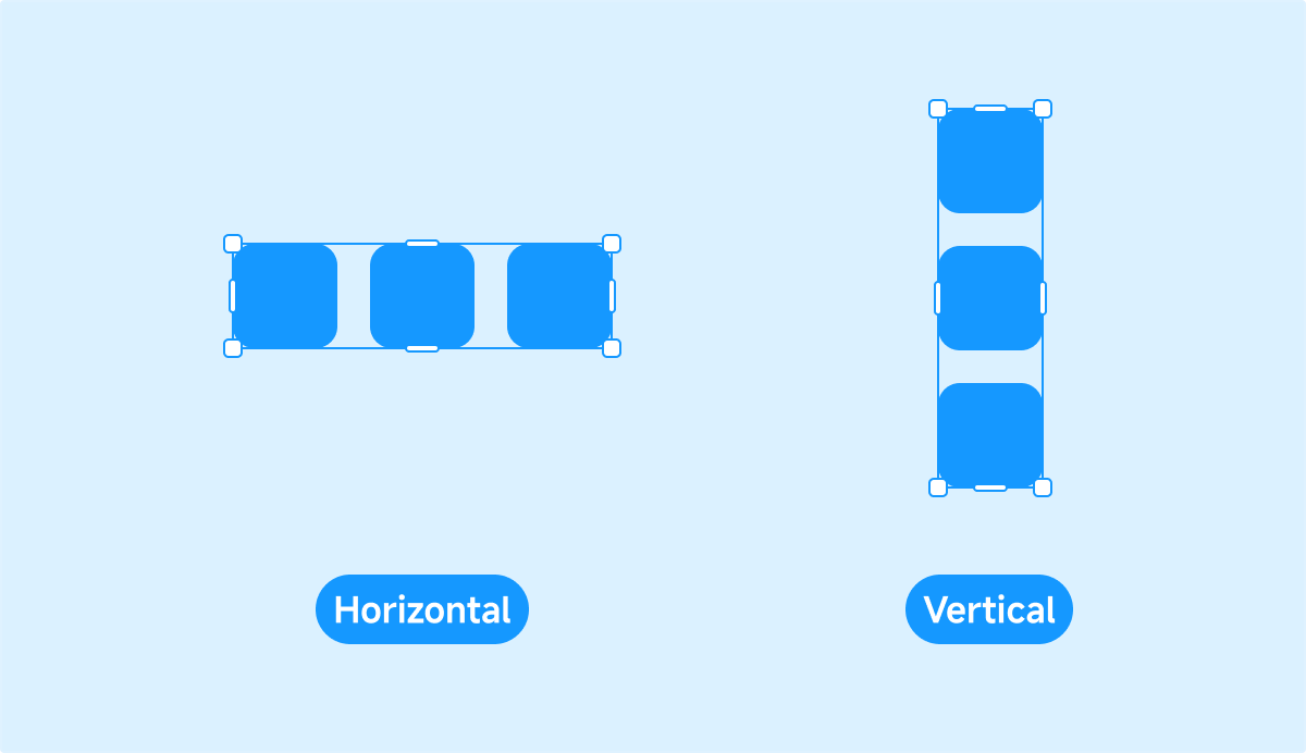
- Horizontal: Add, remove, and reorder objects along the X-axis.
- Vertical: Add, remove, and reorder objects along the Y-axis.
Distribution and Alignment
Adjust the distribution of child components within a page or container and align them relative to the parent.
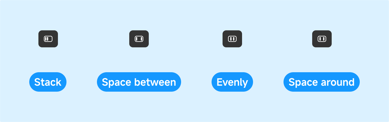
-
Stack:

-
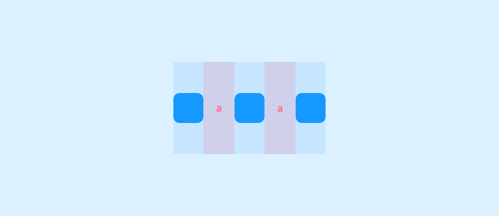
Space Between: Equal spacing between components; the first and last components are flush with the container edges.
-
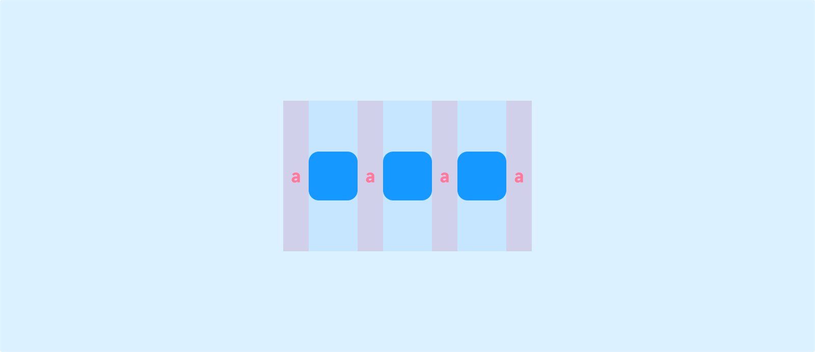
Space Evenly: Equal spacing between components and equal margins at both ends of the container.
-
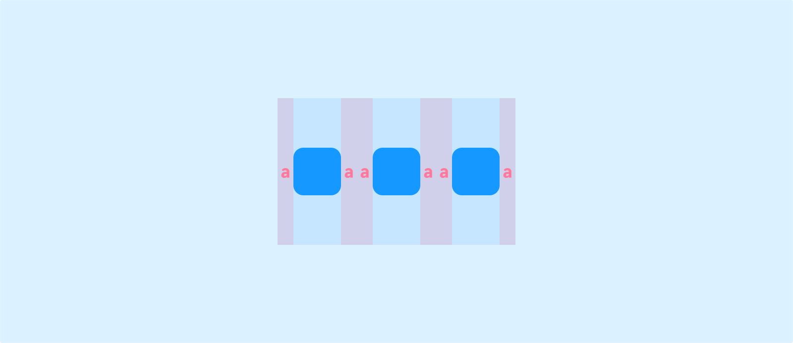
Space Around: Each component has equal spacing on both sides, making them appear “evenly surrounded.” The gaps at the ends are half the size of the gaps between components.
Wrapping
When content width exceeds the available space of the container, content wraps to the next line.
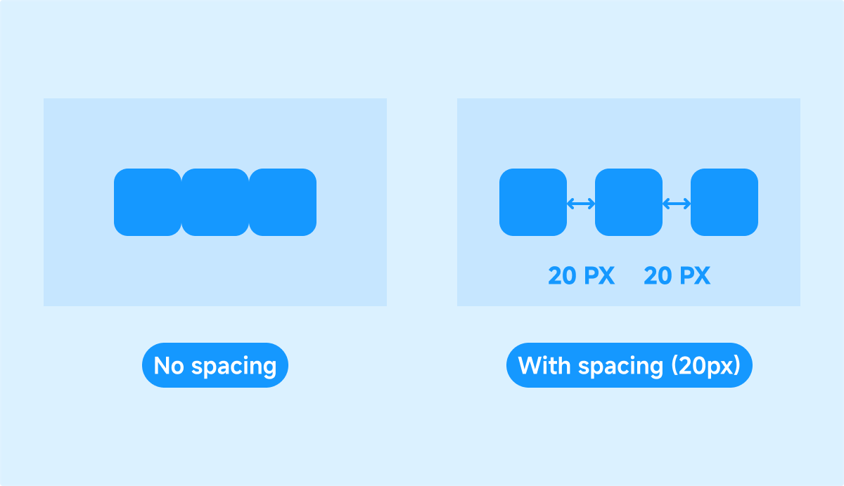
Gap
Set the spacing between child components within a page or container.
Overflow

- Scroll: When content overflows, a scrollbar appears on the parent, allowing you to scroll to view the overflowed content.
- Visible: Overflowed content remains visible outside the parent.
- Hidden: Overflowed content is hidden and not visible outside the parent.
Position
Type
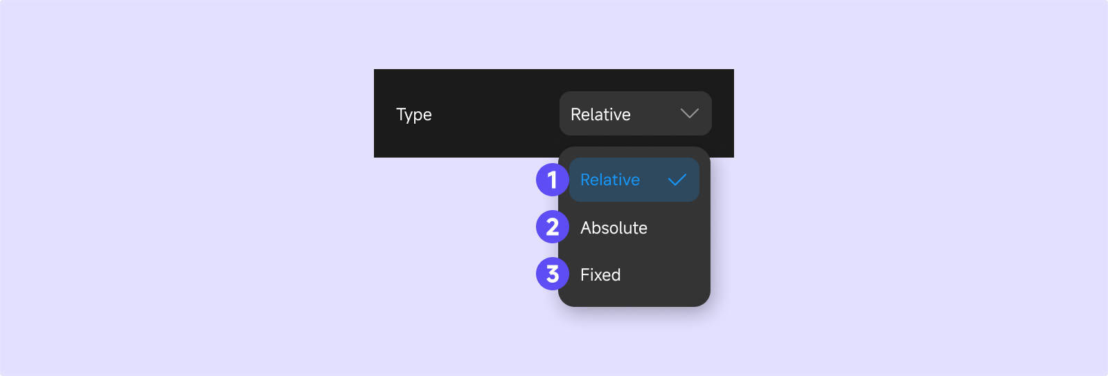
- Relative: Components are arranged in order according to the parent’s layout.
- Absolute: Components are positioned at a fixed location relative to their parent (top-left, top-right, bottom-left, bottom-right).
- Fixed: Components are positioned at a fixed location relative to the browser viewport and remain fixed even when the page scrolls.
Layer
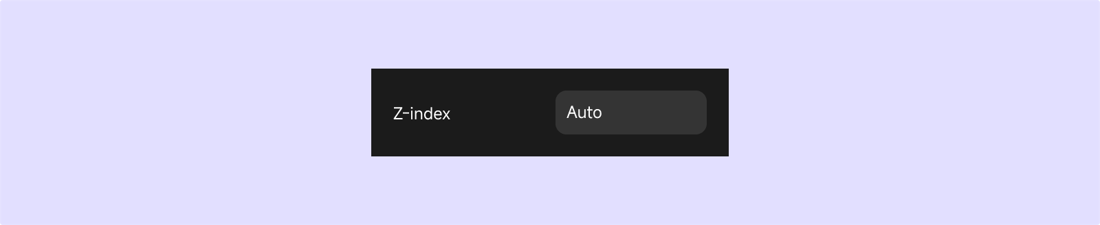
- The default layer for all components is “auto,” meaning all components are on the same layer.
- You can manually set a component’s layer (z-index). Higher values indicate a higher layer; components on higher layers cover those on lower layers.
- Components on the same layer are displayed in the order they are added; later additions cover earlier ones.