Custom Component
Overview
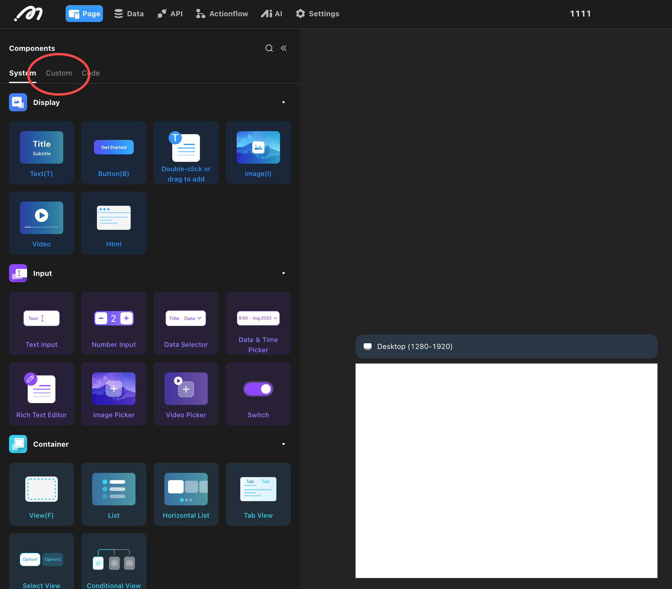
Custom Components allow you to save configured components for reuse throughout your project. This feature streamlines UI building, especially as application complexity grows, by enabling you to add reusable components to the left sidebar component library.
Benefits
- Reusable Across Pages: Once saved, a Custom Component can be dragged onto any page within the project.
- Collaborative Efficiency: Project collaborators can use saved Custom Components, improving team productivity.
Typical Scenarios
Common reusable components include navigation bars, product lists, and user info panels. Build the UI once, save it as a Custom Component, and then drag it from the left sidebar’s Custom Component library to use on other pages.
How to Use
-
Create:
Select a component, then save it as a Custom Component via the right-click menu or the shortcutCmd+Shift+K. All content, style, data configuration, and action configuration structures are saved. If there are data dependencies in the configuration, you must delete and reconfigure those items.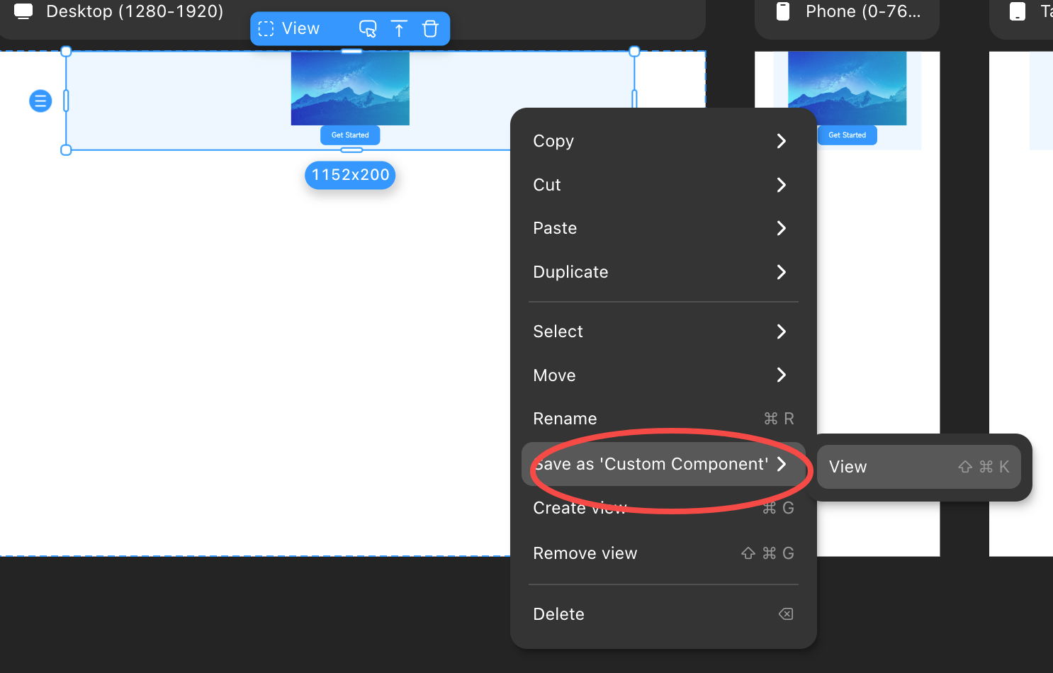
-
Fill in Information:
In the Custom Component panel, a preview image is generated automatically (you can upload your own). Name the component and add a description. Click save to add it to the left sidebar under Custom Components. -
Reuse:
Drag or double-click the saved component from the left sidebar to add it to other pages. If you have many Custom Components, use the description in the upper right to find the one you need.
Limitations
- Each project can save up to 1000 Custom Components.
- Editing the style of a Custom Component after saving is not supported.
- Custom Components cannot be used across different projects.