Breakpoints
In responsive web design, breakpoints are predefined screen width thresholds. When the browser or device viewport width reaches these thresholds, the webpage’s layout and styles automatically adjust to accommodate different screen sizes, ensuring a consistent and optimized visual and interactive experience across all devices.
Benefits
- Enhance User Experience: Responsive design ensures users receive a consistent and optimized visual and interactive experience across different devices.
- Improve Development Efficiency: With preset breakpoints, developers can quickly adjust layouts and styles without manually testing on different devices.
- Optimize SEO Performance: Responsive design helps improve website rankings in search engines, as search engines favor websites that adapt to different devices and screen sizes.
Breakpoint Configuration
Breakpoint Ranges
Momen provides a set of standard breakpoints to help your application adapt to mainstream device screens. Here are the breakpoint settings and their corresponding screen width ranges in the latest version:
| Breakpoint Name | Width Range (pixels) |
|---|---|
| Desktop | 1280px - 1920px |
| Tablet | 768px - 1279px |
| Phone | 0px - 767px |
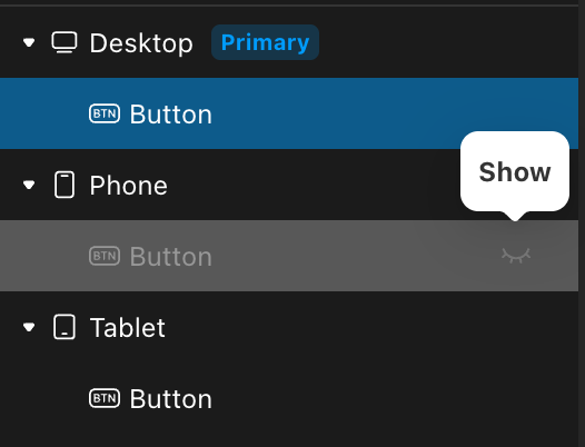
Primary Breakpoint
The primary breakpoint for web projects is Desktop. Following the inheritance principle, modifications made on the primary breakpoint automatically synchronize to other breakpoints.
Non-primary breakpoints support overrides, meaning components can be edited independently on non-primary breakpoints without synchronizing to other breakpoints.
Currently supported design configurations for overrides include: Position, Size, Style, and Layout.