Toast Notifications & Modal
Toast Notification
Overview
This guide explains how to use Momen’s Show Toast action to display concise, informative notifications in your web applications.
Typical Use Cases
Trigger this action to display a toast message at the top of the page. Common scenarios include:
- Displaying “Submit Successfully” after a form submission.
- Showing “Login/Registration Failed” when authentication fails.
How to Configure
The Show Toast action is commonly used to indicate the successful execution of a mutation or operation. You can find the “Show Toast” action under Action on Click > Toast&Modal > Show Toast.
Display Effect
The toast notification appears at the top of the interface, displaying your message in black text on a white background. The style is fixed and cannot be customized.
.png)
Modal Dialog
Overview
This section introduces the modal dialog functionality in Momen, supporting both default and custom modes for flexible user interactions.
Modal Types
Momen provides two modal dialog modes:
-
Default Mode
Configure the title, content, cancel/confirm button text, and define actions for the confirm button. -
Custom Mode
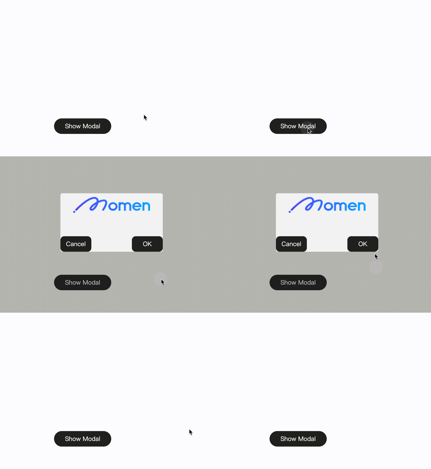
Enter edit mode to drag and drop components into the modal container, allowing full customization.- In the Preview area, adjust the modal’s width, height, and position.
- Under Interaction, enable “Close on click overlay” to allow closing the modal by clicking outside its content area.
- Add the Hide Modal action to components (such as buttons) within the modal to provide explicit close controls.
How to Configure
Default Mode
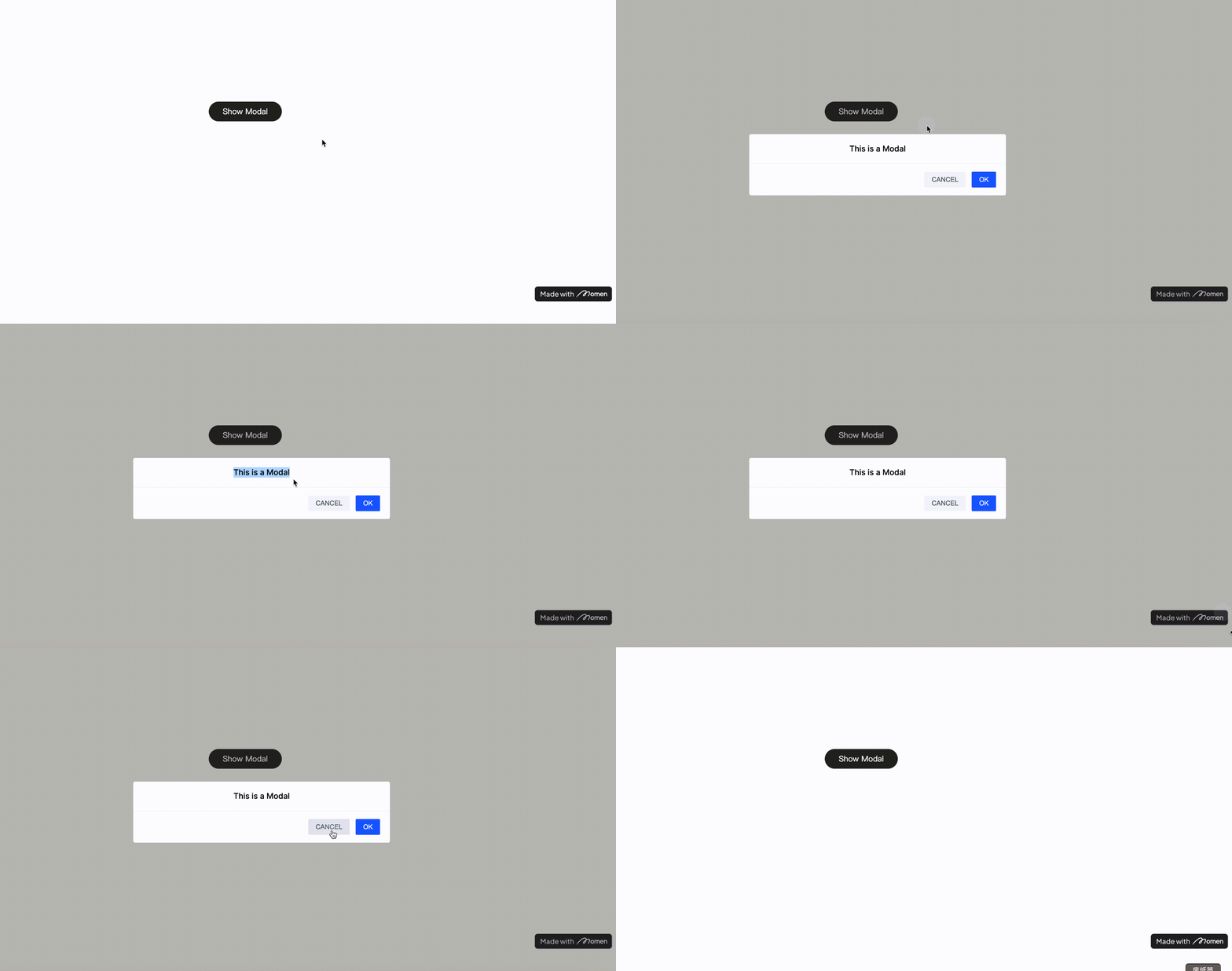
- Go to Action on Click > Toast & Modal > Show Modal > Default.
- Modify the cancel/confirm button text and configure confirm actions as needed.
| Configuration | Example |
|---|---|
.png) |  |
Custom Mode
- Add a Show Modal action and switch the mode to Custom.
- Enter edit mode, then resize and reposition the modal window in the Preview interface.
- Build the modal content by dragging components into the Focus View (upper area).
- Configure modal closing behavior:
- Enable Close on click overlay in the right sidebar of the modal view to allow closing by clicking outside the modal.
- Add a button or other component inside the modal and assign the Hide Modal action to it for explicit closing.
| Configuration | Configuration |
|---|---|
.png) | .png) |

Notes
When triggering a modal action from within a List component, direct access to the list item data is restricted. To work around this:
- Use the Set Page Variable action to transfer the relevant list item data to a page variable.
- Reference this variable in the modal to access the specific data as needed.